Flexible Module for Divi 4
NOTE: The following is a pictorial discussion of the Divi Flexible Grid module (v.0.3.0).
Content
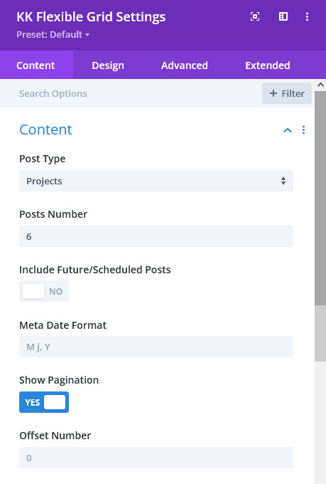
Post Numbers: specify how many posts are to be displayed in the grid.
Include Future/Scheduled Posts: here you can opt to include scheduled posts to include. These will display in the grid, but will not have links to the single post.
Show Pagination: here you can opt to include a paging navigation below the grid.
Offset Number: as in other post based modules, this number determines how many posts, sorted by date, are to be skipped in the post query.
Elements
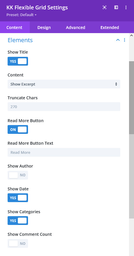
Content: choose to show full content, excerpt or no content.
Truncate Chars: if Excerpt is chosen above, any excerpt entered into the post editor metabox will take precedence over creating an excerpt from any textual content within the post. This control sets the number of characters that will be in the created excerpt.
Read More Button: this enables either Read More text or Divi Button. The Divi Button can be opted for and styled under the Design tab.
Read More Button Text: if Read More is enabled, you can change the text here.
Show Author, Show Date, Show Categories and Show Comments: these controls allow opting to display the indicated post metadata.
Layout - Layout
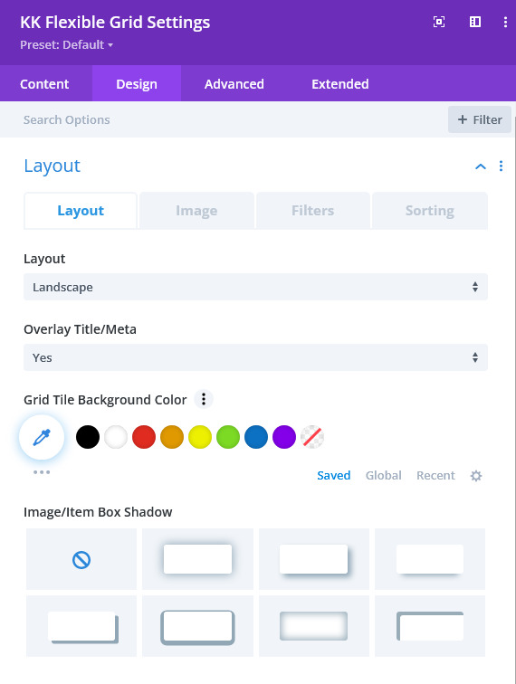
Overlay Title/Meta: there are three choices here for including post Title and Metadata for each grid tile. No will cause the Title and/or Meta to display below the image, Yes will display the same over the image and Hover will create an overlay of the same to display upon mouse hover or mobile tap.
Note: if Hover is chosen above, an additional control will appear allowing a choice of one of ten different animation reveals.
Grid Tile Background Color: this enables changing the default background color of the tiles. This would mainly be useful for when Title/Meta is shown below the image.
Image/Item and Filter Styling: in these groupings, there are several controls to style the grid tiles and filter items.
Layout - Image
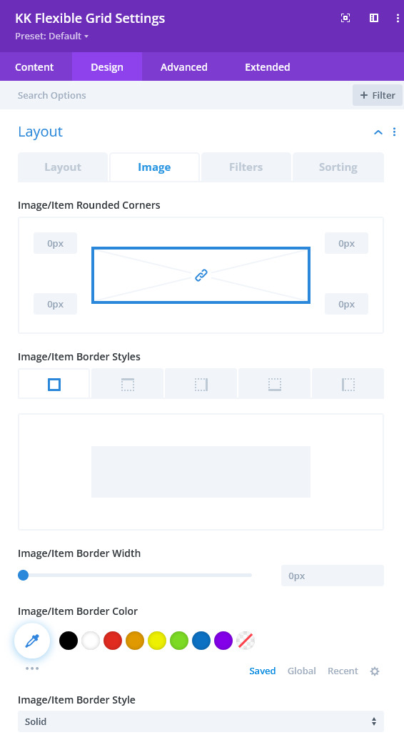
Image: if desired, these controls will allow styling the border around the item images.
Layout - Filters
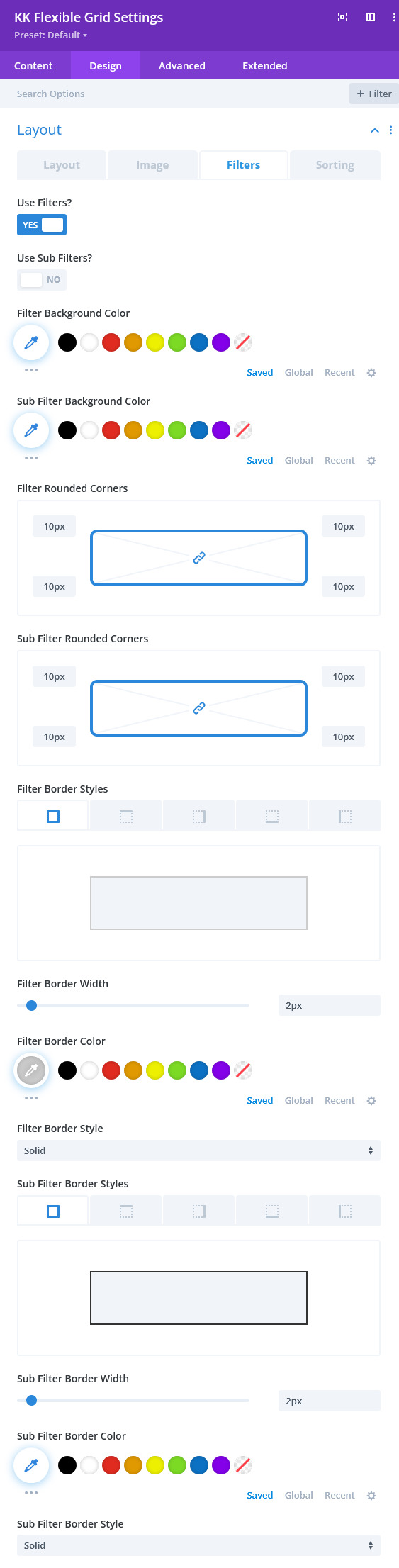
Filters: the two toggles at the top enables both of the filter rows of links. Use Filters? represents the first and top row of links/buttons and are the parent taxonomy for the chosen post type. Use Sub-Filters? represents the second tier of links/buttons and are the first children of the parent. The parent must be chosen and made active before the children appear.
The remainder of the settings in this tab are for styling of the links including the border of each which is necessary for the button look and feel, though this styling is not necessary.
Layout - Sorting
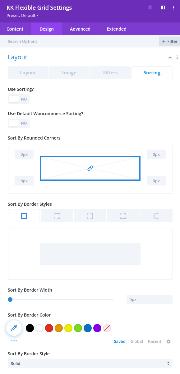
Sorting: the toggle at the top enables sorting which provides a separate row of links/buttons in the same space used for filtering. In this version of the module, a few of the common sorting selections that Woocommerce offers appears along with three other selections. The Sort link/button will toggle the sorting row to appear.
The remainder of the settings in this tab are for styling of the links including the border of each which is necessary for the button look and feel, though this styling is not necessary.
Text
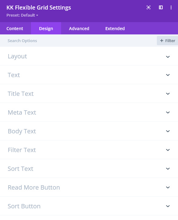
Text: there are several controls that have the usual styling controls for the various content entities in the grid.
Read More Button-Use Custom Styles For Read More: as with other modules having a Divi button, there is a full assortment of controls for styling the Read More link within the grid tiles.
Sort Button-Use Custom Styles For Sort: as with other modules having a Divi button, there is a full assortment of controls for styling the Read More link within the grid tiles.
Layout
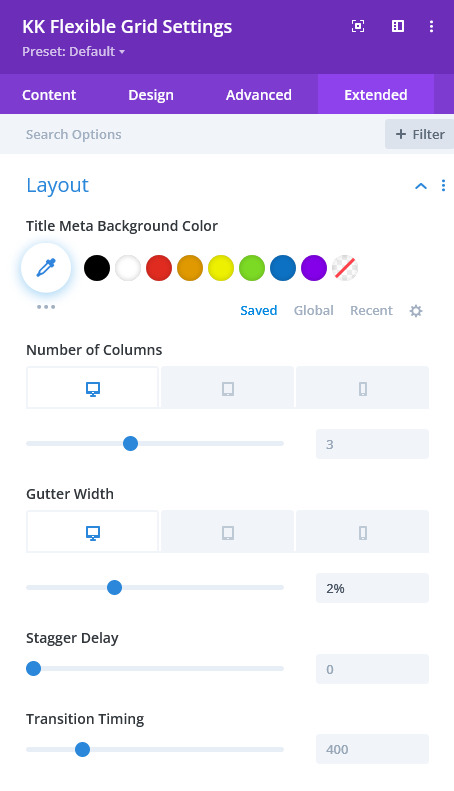
Number of Columns: specify how many columns to display in the grid. Instead of @media queries, you can specify the number of columns for each device given.
Gutter Width: specify the gutter (or space) between the tiles. This will be apply to both horizontal and vertical spacing.
Stagger Delay: for the animation associated with filtering, this control will delay the movement of each tile in succession.
Transition Timing: this timing in milliseconds is the total time for all animations to complete.
Reveal Content
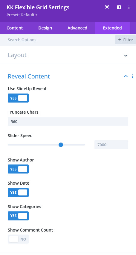
Truncate Chars: as within the grid tiles, this controls how much the body content will be truncated.
Slider Speed: if the Slider Maker metabox is used within the post editor, this control set in milliseconds determines the time each slide displays.
Show Author, Show Date, Show Categories and Show Comments: these controls allow opting to display the indicated post metadata.
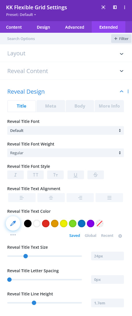
Reveal Design